
HISTORY
The scatter plot was first used in the early 19th century by John Herschel, an English astronomer and mathematician, in the 1830s.
John Herschel, an early user of the scatter plot, applied it to visualize and analyze astronomical data. His interest was in understanding relationships between different celestial observations.
However, it was only in the early 20th century that the scatter plot became widely recognized as a statistical tool, largely thanks to Francis Galton, an English polymath who used scatter plots to analyze the relationship between parents’ and children’s heights. He plotted heights of parents against their offspring to visually assess how traits were inherited.

This work contributed to the development of the concept of regression and correlation, fundamental ideas in statistics today.
SCATTER PLOT
As the name suggests, the word scatter means dispersed in different directions, so does the google say:-

Simplest definition would be “ A plot which is used to visualise the correlation between two variables ”

Hang on, first let’s understand the Correlation-ship
Correlation is when two things seem to be connected. It means that when one thing changes, the other often changes in a predictable way. Most importantly, Correlation doesn’t mean one thing causes the other, but rather that they move together in some way.
Let’s begin with some simple examples,

Life Example: Coffee and Energy

- Imagine you drink coffee every morning. On days when you have more coffee, you might feel more energetic, and on days without coffee, you feel a little tired. There’s a correlation between drinking coffee and feeling energetic, but coffee doesn’t guarantee energy (some people feel jittery or still sleepy). However, there’s a predictable connection between the two.
Sports Example: Practice and Performance
- Imagine a soccer player. The more they practice, the better they often perform in games. There’s a positive correlation between practice time and performance. Overall, there’s a strong connection between practice and performance.
Use Cases:-
When people ask me for the use cases of a scatter plot, I often respond with, “Well, what’s the use case of electricity?” They usually pause, realizing it’s hard to name just one — there are so many.
That’s exactly the point with scatter plots, too. They’re incredibly versatile, helping usuncover patterns, trends, and relationships across all kinds of data. It’s difficult to limit them to just one use case because, like electricity, they have countless applications wherever data exists.
But Let’s frame Scatter plot, how does it helps ?
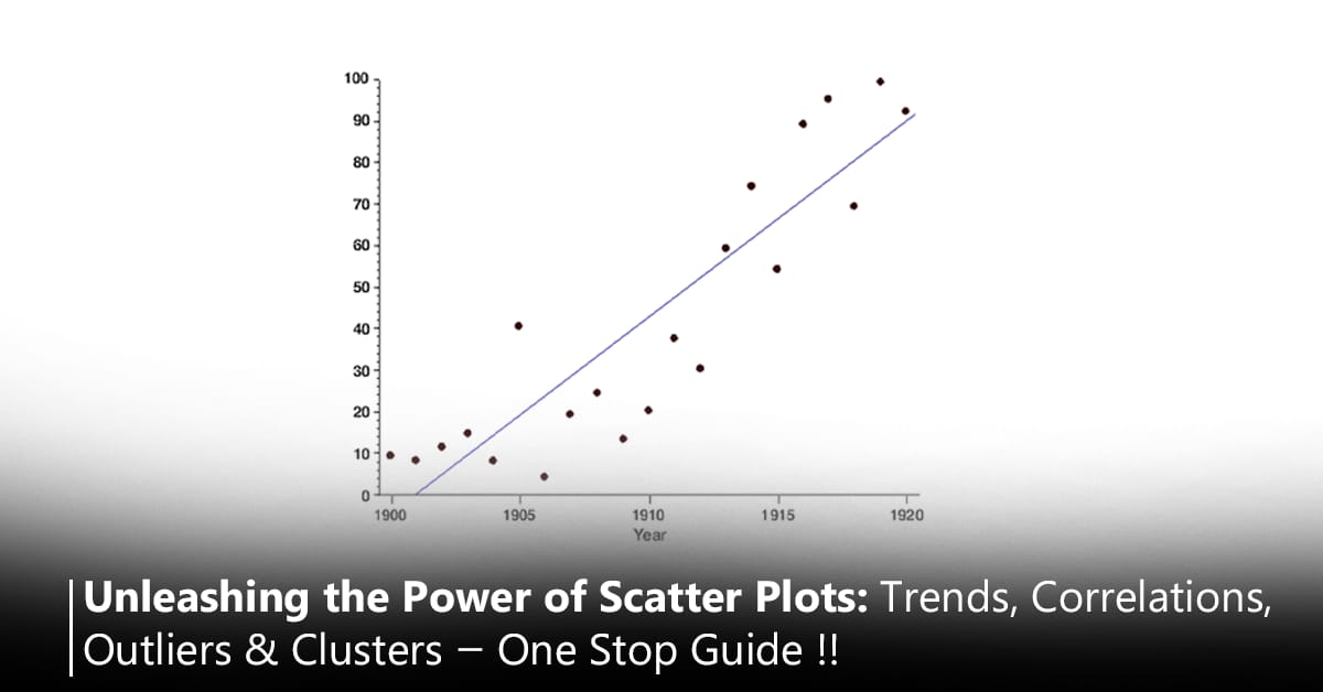
- Correlations: The overall pattern of the scatterplot can give you insights into the relationship between the two variables.
Types of Correlations in Scatter Plots:
- Positive Correlation: As the X variable increases, the Y variable also increases (dots trend upwards).
- Negative Correlation: As the X variable increases, the Y variable decreases (dots trend downwards).
- No Correlation: There’s no clear pattern in the dots; X and Y are unrelated.

- Clusters: We can spot groupings or clusters in the data, indicating that certain values tend to occur together.

Customer Segmentation in Retail: Retailers can use clusters to identify customer segments, like high-spending young adults or budget-conscious seniors. Marketing campaigns can then be tailored to each segment.
Healthcare: Clusters of patients’ ages and cholesterol levels could reveal groups at risk of certain health conditions.

Customer Segmentation by Balance & Number of Transactions: You may observe clusters in the scatter plot, such as:
Cluster 1: Low Balance, Low Transactions
Customers with low account balances (below $10,000) and low transaction frequency (1–5 transactions). These might be casual users or new account holders.
Cluster 2: Moderate Balance, Moderate Transactions
Customers with balances between $10,000-$50,000 and moderate transactions (6–15 transactions). These could be steady customers who use their accounts actively.
Cluster 3: High Balance, High Transactions
High-net-worth customers with balances over $200,000 and frequent transactions (15+ transactions). These are likely premium customers who may benefit from personalized services or wealth management options.
- Outliers: Scatterplots make outliers stand out.

Fraudulent Transactions: Customers with an unusually high number of transactions but low balance, or vice versa, might be flagged as potential anomalies (e.g., possible fraud or special cases requiring closer attention).

A picture can be worth 1,000 correlation coefficients! — Precaution 🙈
It’s important to remember that relying exclusively on the correlation coefficient can be misleading — particularly in situations involving extreme outliers.
Looking at a scatterplot can provide insights on how outliers — unusual observations in our data — can skew the correlation coefficient.
Let’s look at an example with one extreme outlier. The correlation coefficient indicates that there is a relatively strong positive relationship between X and Y. But when the outlier is removed, the correlation coefficient is near zero.

Still Confused:- Just observe below carefully,

Now, Hakuna Matata way means my way:-
Let’s try to understand with story of me and my friend Kartikay.
I have my close friend in france— kartikay. We both might have a lot of things in common and seem to move in sync, Let’s dive deeper with a relatable example.

Me and Kartikay : A Perfect Positive Correlation
Think about how I and Kartikay influence each other’s moods. On days when we both are hanging out, laughing, and having fun, I probably feel happier, and so does he. If someone plotted this on a graph, they might see a positive trend: when my mood is up, Kartikay’s mood is up too. This is positive correlation in action — our happiness levels move together!
Negative Correlation: Like Opposites
Let’s flip the script. Maybe I and Kartikay are study partners, and when one of us starts slacking off, the other feels the pressure to work harder. If we graph this relationship, we might see a negative correlation: as one of us studies more, the other tends to study less. So, in this case, there’s still a correlation, but the relationship moves in opposite directions.


No Correlation : Independent Lives No Pattern, Just Dots.. 😭😭

Maybe on some days, I am feeling super energetic and talkative, while Kartikay is in a quiet mood. Other days, it’s the opposite — kartikay is excited and full of energy, while I am feeling a bit low-key. And sometimes, both of us feel the same, but there’s no consistency in how we match up. Our moods and activities don’t move together in any clear, predictable way.
If we put this on a scatter plot, with my mood on one axis and Kartikay mood on the other, we’d see dots scattered randomly across the chart. There wouldn’t be an upward or downward trend — just a collection of dots without any clear line or shape. This randomness tells us there’s no correlation between your moods.

What This Means for Our Friendship
No correlation doesn’t mean we are not close friends. It just means that my feelings, actions, or daily choices don’t necessarily reflect each other. We are two individuals with our own lives, who don’t need to match up all the time to stay connected. ( Although its not true, we are close 😂 )
The Bigger Picture — What it really meant ✌️
In data science, no correlation simply means there’s no pattern between the two things being compared. Just like how my mood and Kartikay’s might be totally independent, some data points in the real world don’t have a connection, even if we expect them to. This is an important finding in itself: not everything needs to be connected or predictable.
The truth is we never want our dependent variable to have a no correlation with Independent variables and want to get rid of this situation. 😎

Let’s measure the correlation of my friendship on scale of 0 to 1.

Thus, we never want 0 or nearby values.
More specifically,

Observe carefully how data distribution changes from -1 to 1.

Tip :- Avoid a scatter plot when you have too large a set of data.
When you have so much data in your scatter plot that it clogs up the entire graph, this is the result of overplotting.
Statistician Nathan Yau sums up this phenomenon pretty well in the below graphic:

Correlation vs. Causation: Friends, Not Puppets
Now, does my happiness cause Kartikay to feel happy? Not directly. There’s a connection, but it’snot a strict “cause and effect.” Instead, it’s more like a natural harmony. My happiness and Kartikay’s happiness are correlated, meaning they tend to move together in the same direction, without one being the absolute reason for the other.
Finally, remember that correlation doesn’t imply causation. Just because my and kartikay’s happiness levels tend to move together doesn’t mean one of us directly causes the other’s mood to change.

Correlation means a relationship exists, but it’s not about control — it’s about natural patterns. My connection with Kartikay’s is like a dance where we both move in sync, influenced by each other without being forced.
Python Code
mport matplotlib.pyplot as plt

# Sample data
x = [1, 2, 3, 4, 5]
y = [5, 4, 3, 2, 1]

# Create a scatter plot
plt.scatter(x, y, color='blue', s=70, edgecolor='k')

# Add labels and title
plt.xlabel('X-axis')
plt.ylabel('Y-axis')
plt.title('Simple Scatter Plot')

# Show plot
plt.show()